

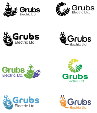


Branding an Electricity Company
Discover Grubs Electric Ltd.’s commitment to innovation with our eco-conscious electrical services. Our website, powered by Next.js, ensures a seamless experience with ultra-fast loading speeds. Dive into a world where sophistication meets sustainability.
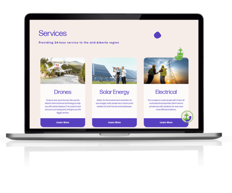
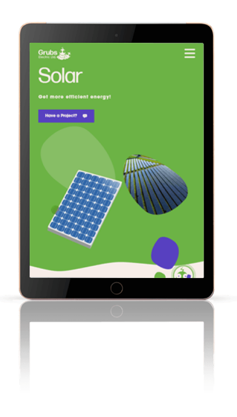
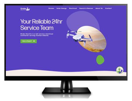
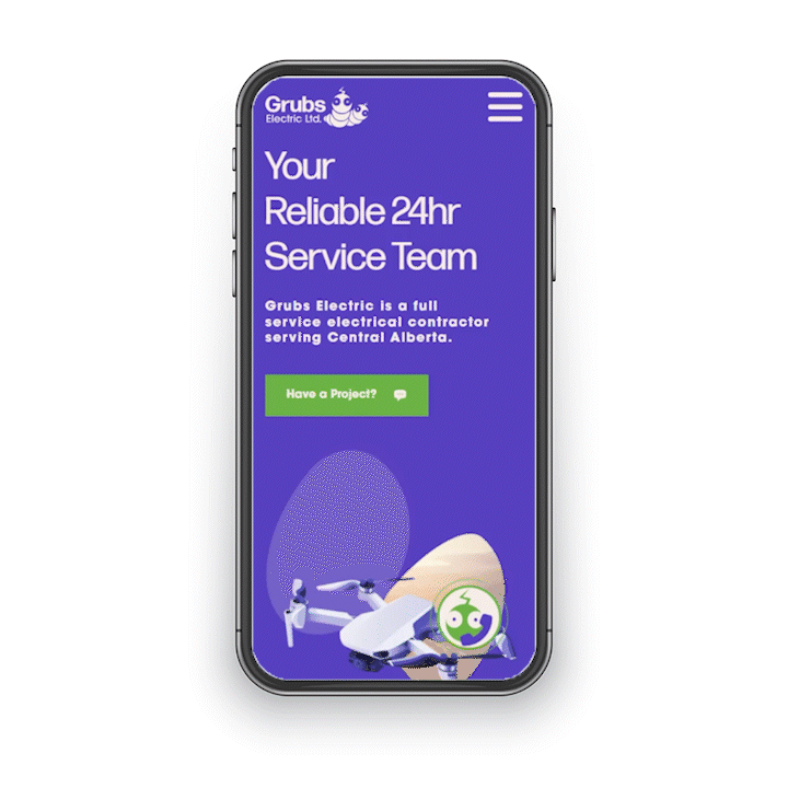
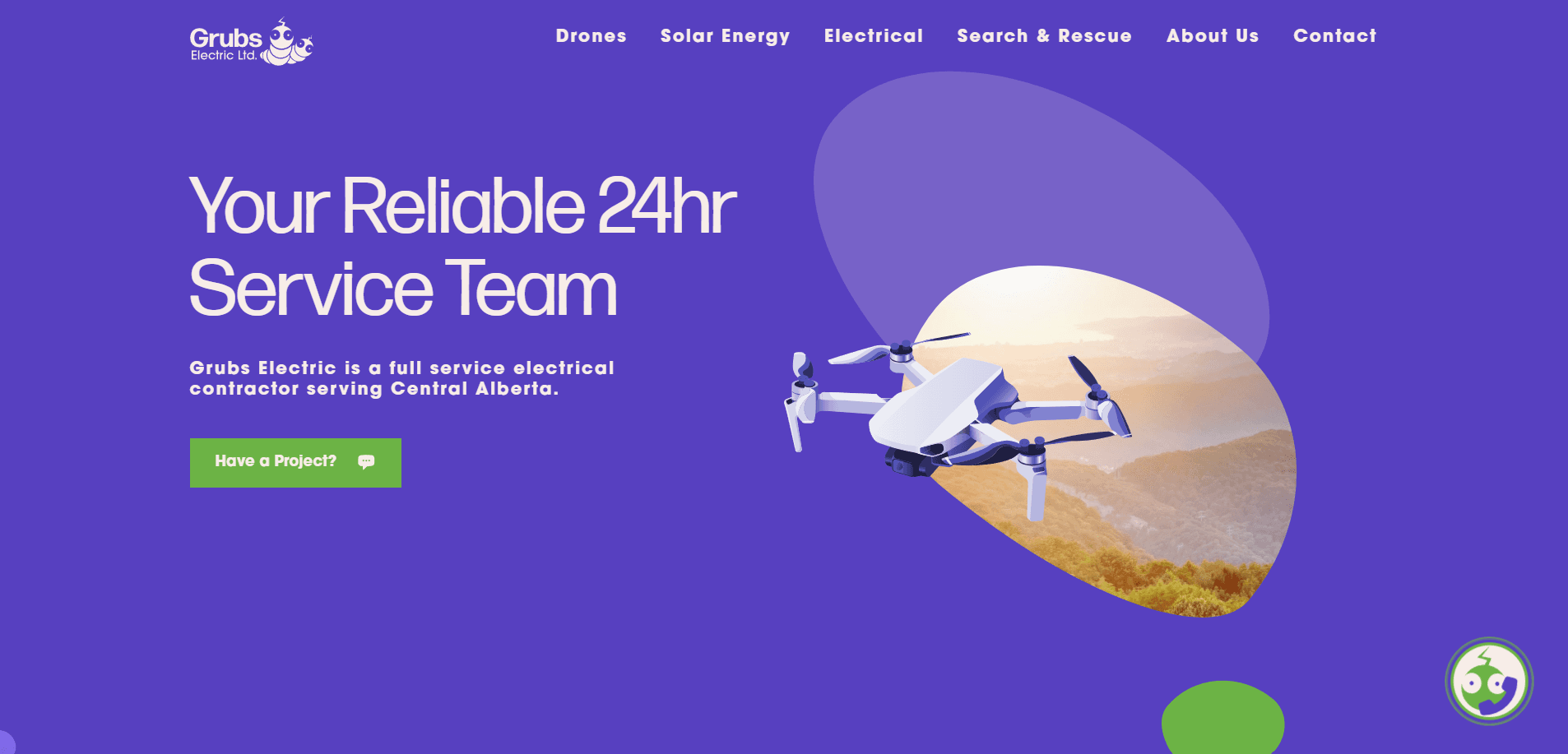
This project demanded a design communicating Grub Electric’s commitment to innovation with their eco-conscious electrical services. We responded with a sophisticated website build powered by Next.js, ensuring a seamless experience with ultra-fast loading speeds. This design choice resonates with the company's name while adding a playful element to the brand's identity with simple animations.

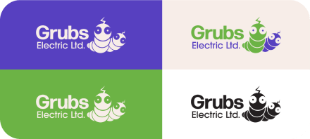
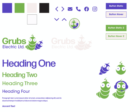
Overall, the website merges cleanliness and approachability through its font and illustrations, while the colour choice communicates the company's core values and industry positioning. This cohesive design strategy sets the stage for introducing Grubs Electric's services, highlighting its unique identity in the electrical services market.
The project leverages the power of Next.js, a React-based framework that enables exceptional performance and fast page loading. Next.js is known for its server-side rendering and static generation capabilities, which significantly improve the speed and efficiency of websites.
By choosing Next.js for the Grubs Electric site, the development team prioritized a swift, seamless user experience. The framework's automatic code splitting ensures that each page only loads the JavaScript needed for that page, minimizing load times. Moreover, Next.js's built-in image optimization automatically resizes and optimizes images for the web, further enhancing speed without sacrificing visual quality.
With Next.js, the Grubs Electric website benefits from enhanced SEO due to server-side rendering, which allows search engines to crawl content more effectively. Using static generation for pages also means that content can be served directly from a CDN, reducing latency and improving the site's overall responsiveness.
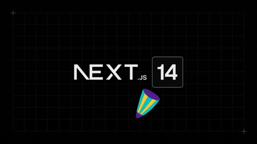
Integrating Next.js into the Grubs Electric website project showcases a commitment to cutting-edge web technology, which aligns with the company's priorities and sets the tone for its leadership within the electric industry.